
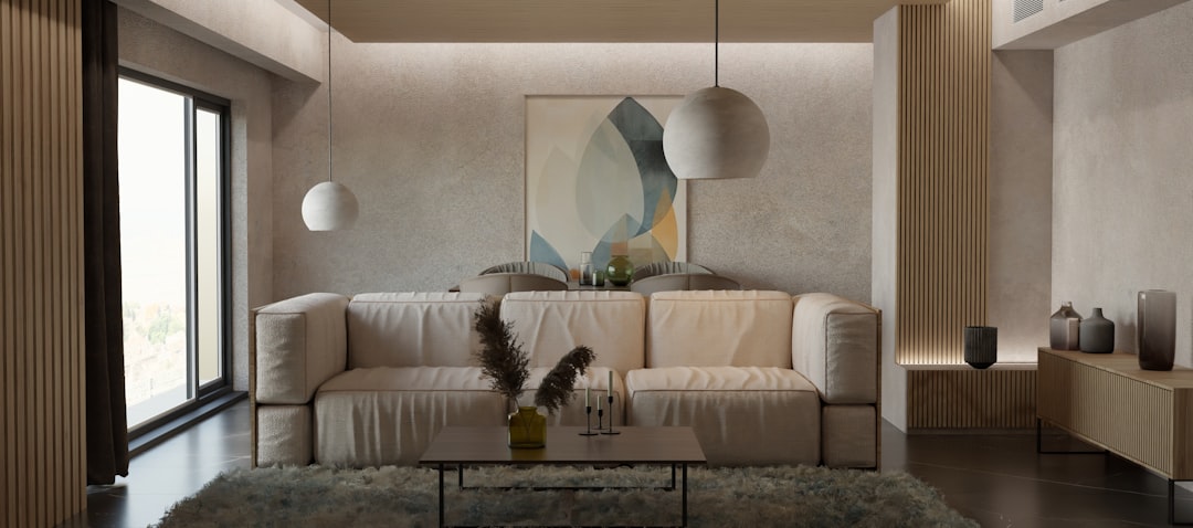
In the realm of interior design, the significance of a well-thought-out color palette cannot be overstated. A color palette serves as the foundation upon which the entire aesthetic of a space is built. It influences not only the visual appeal of a room but also the emotional response it elicits from those who inhabit it. A carefully curated selection of colors can create a sense of harmony and balance, while a poorly chosen palette can lead to discord and discomfort. Therefore, understanding the importance of color in interior design is essential for anyone looking to create a space that feels cohesive and inviting.
Moreover, a color palette can reflect personal style and preferences, allowing individuals to express their identity through their living spaces. Whether one prefers bold, vibrant hues or soft, muted tones, the colors chosen can tell a story about the inhabitants. This narrative aspect of color is what makes it such a powerful tool in design. By selecting a color palette that resonates with their personality, individuals can transform their homes into true reflections of themselves, enhancing their overall living experience.
If you’re looking to enhance your home’s interior design by discovering your ideal color palette, you might find it helpful to explore related concepts in outdoor spaces as well. A great resource is the article on how to use color to enhance your outdoor spaces, which provides insights into color selection that can complement your indoor choices. You can read it here: how to use color to enhance your outdoor spaces. This connection between indoor and outdoor color schemes can create a harmonious flow throughout your home.
Exploring Different Color Schemes and Their Effects on Mood
Color schemes play a pivotal role in shaping the mood and atmosphere of a space. Different combinations of colors can evoke various emotions and feelings, making it crucial to understand how they interact with one another. For instance, warm colors such as reds, oranges, and yellows are often associated with energy and warmth, making them ideal for social spaces like living rooms or kitchens. These colors can stimulate conversation and create an inviting environment for gatherings.
On the other hand, cool colors like blues, greens, and purples tend to promote calmness and relaxation. These shades are often favored in bedrooms and bathrooms, where tranquility is desired. The psychological effects of color are profound; they can influence heart rates, moods, and even productivity levels. By exploring different color schemes and their effects on mood, individuals can make informed decisions about how to design their spaces to foster the desired emotional responses.
How to Choose the Right Colors for Each Room in Your Home
Choosing the right colors for each room in a home requires careful consideration of both function and aesthetics. Each space serves a unique purpose, and the colors selected should align with that purpose. For example, in a home office, one might opt for energizing colors that promote focus and creativity, such as bright yellows or greens. In contrast, a bedroom may benefit from softer hues that encourage relaxation and restfulness, such as pale blues or gentle lavenders.
Additionally, it is essential to consider the natural light available in each room when selecting colors. A room flooded with sunlight may allow for bolder choices, while a dimly lit space may require lighter shades to prevent it from feeling cramped or gloomy. By taking into account both the function of each room and the quality of light it receives, individuals can choose colors that enhance the overall atmosphere and usability of their home.
Using Color Psychology to Create a Harmonious Living Space
Color psychology is an intriguing field that delves into how colors affect human behavior and emotions. By harnessing this knowledge, individuals can create harmonious living spaces that promote well-being and comfort. For instance, incorporating shades of green can evoke feelings of tranquility and balance, making it an excellent choice for areas meant for relaxation or reflection. Similarly, incorporating warm tones can foster feelings of warmth and connection among family members.
To create a harmonious living space, it is essential to consider not only individual colors but also how they interact with one another. Complementary colors can create visual interest while maintaining balance, while analogous colors can provide a sense of unity throughout a space. By thoughtfully applying principles of color psychology, individuals can design environments that not only look beautiful but also feel nurturing and supportive.
If you’re looking to enhance your interior design skills, a great companion article is available that offers insights on mixing bold colors in your decor. Understanding how to create a harmonious color palette is essential, and this resource can help you explore various combinations that can elevate your space. You can check out the article for more tips on achieving a vibrant yet cohesive look in your home by visiting this link.
Incorporating Neutrals and Accents to Balance Your Color Palette
While bold colors can make a statement, incorporating neutrals into a color palette is crucial for achieving balance. Neutrals serve as a grounding force within a design scheme, providing visual relief from more vibrant hues. Shades like beige, gray, white, and taupe can help to create a cohesive look by allowing bolder colors to shine without overwhelming the senses.
Accents are another vital component in balancing a color palette. These are typically brighter or darker shades used sparingly to add depth and interest to a room. For example, a neutral living room can be enlivened with vibrant throw pillows or artwork that incorporates pops of color. By strategically using neutrals alongside accent colors, individuals can create spaces that feel well-rounded and thoughtfully designed.
Tips for Mixing and Matching Colors to Create a Cohesive Look
Mixing and matching colors can be an art form in itself, requiring an understanding of color theory and an eye for aesthetics. One effective approach is to use the 60-30-10 rule: 60% of the room should be dominated by a primary color, 30% by a secondary color, and 10% by an accent color. This guideline helps maintain balance while allowing for creativity in color selection.
Another tip for achieving cohesion is to choose colors from the same family or those that complement each other on the color wheel. For instance, pairing various shades of blue with green can create a serene coastal vibe, while mixing warm earth tones can evoke feelings of warmth and comfort. By being mindful of how colors interact with one another, individuals can successfully mix and match hues to create visually appealing spaces.
The Role of Lighting in Enhancing Your Chosen Color Palette
Lighting plays an integral role in how colors are perceived within a space. Natural light can dramatically alter the appearance of paint colors throughout the day; what may look warm and inviting in daylight could appear cold or stark under artificial lighting. Therefore, it is essential to consider both natural and artificial light sources when selecting colors for a room.
Different types of artificial lighting—such as incandescent, fluorescent, or LED—can also affect how colors are perceived. Warm light tends to enhance warm tones while cool light can make cooler shades pop. To ensure that the chosen color palette looks its best at all times of day, individuals should test paint samples under various lighting conditions before making final decisions.
How to Test Your Color Palette Before Committing to a Full Room Makeover
Before committing to a full room makeover based on a selected color palette, it is wise to conduct thorough testing. One effective method is to paint swatches on the walls in different areas of the room to observe how they look at various times throughout the day. This practice allows individuals to see how natural light interacts with their chosen colors and how they change under different lighting conditions.
Additionally, using large poster boards painted with sample colors can provide flexibility in testing combinations without making permanent changes. By moving these boards around the room, individuals can visualize how different hues work together in various contexts before settling on their final choices.
Utilizing Color Wheel and Color Theory to Create Your Perfect Palette
The color wheel is an invaluable tool for anyone looking to create an effective color palette. It illustrates the relationships between primary, secondary, and tertiary colors, providing insight into how they can be combined harmoniously. Understanding concepts such as complementary colors (those opposite each other on the wheel) or analogous colors (those next to each other) can guide individuals in selecting combinations that are visually appealing.
By applying principles from color theory—such as contrast, saturation, and harmony—individuals can craft palettes that resonate with their personal style while also achieving aesthetic balance. This foundational knowledge empowers them to make informed decisions about their color choices throughout their home.
In the ever-evolving world of interior design, trends come and go; however, timeless color choices remain steadfast in their appeal. While it can be tempting to embrace current trends—such as bold jewel tones or minimalist monochromes—individuals should consider how these choices will age over time within their spaces. Striking a balance between trendy hues and classic shades allows for flexibility in design while ensuring longevity.
Incorporating timeless elements into a design scheme does not mean sacrificing personal style; rather, it provides a solid foundation upon which trendy accents can be layered. For example, pairing neutral walls with trendy furniture or decor items allows individuals to stay current without committing fully to fleeting trends.
Seeking Professional Help: When to Consult an Interior Designer for Color Palette Guidance
While many individuals may feel confident in their ability to choose colors for their homes, there are times when seeking professional help from an interior designer is beneficial. Designers possess expertise in color theory and trends that can elevate a space beyond what one might achieve alone. They can provide valuable insights into how different colors interact within specific environments and offer tailored recommendations based on individual preferences.
Consulting an interior designer becomes particularly important when tackling larger projects or when individuals feel overwhelmed by choices available on the market today. A designer’s guidance can streamline decision-making processes while ensuring that the final result aligns with both aesthetic desires and functional needs.
In conclusion, understanding the importance of color palettes in interior design is essential for creating harmonious living spaces that reflect personal style while promoting well-being. By exploring different color schemes, utilizing color psychology, incorporating neutrals and accents, testing palettes before committing fully, and seeking professional guidance when necessary, individuals can transform their homes into beautiful sanctuaries that resonate with their unique identities.

