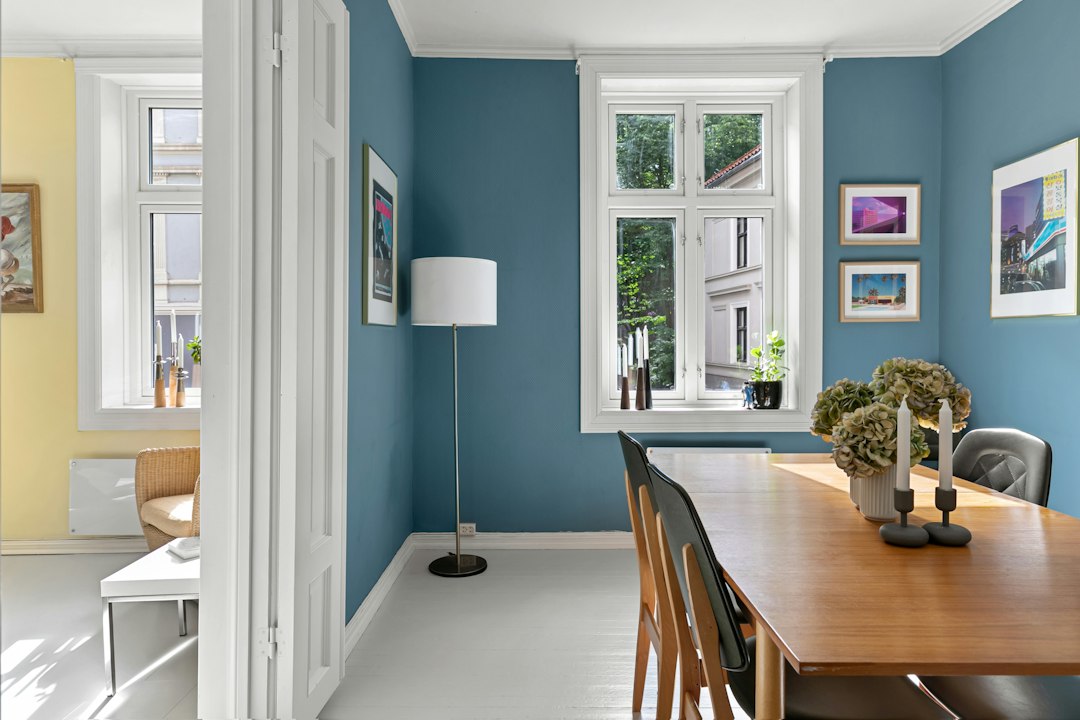
Warm wood textures refer to the natural characteristics of wood that evoke a sense of coziness and comfort. These textures are often associated with rich, earthy tones that can range from deep browns to golden hues. The grain patterns, knots, and finishes of warm woods contribute to their inviting appearance, making them a popular choice in interior design. Woods such as oak, cherry, and walnut are prime examples of materials that exhibit these warm qualities. Their inherent warmth can create a welcoming atmosphere in any space, whether it be a home, office, or commercial environment.
The tactile nature of warm wood textures also plays a significant role in their appeal. When one runs their fingers over a well-finished wooden surface, the smoothness combined with the organic patterns can evoke feelings of nostalgia and connection to nature. This sensory experience is crucial in design, as it can influence how individuals feel within a space. By incorporating warm wood textures into a design scheme, one can establish a foundation of warmth that complements various color palettes and styles.
In exploring the value of contrasts between warm wooden textures and cool colors, it can be beneficial to consider how these elements interact within a broader design context. A related article that delves into the intricacies of color selection is available at How to Select the Perfect Color Scheme for Your Website. This resource provides insights into creating harmonious color palettes that can enhance the overall aesthetic of any space or project, making it a valuable read for those interested in design principles.
Exploring Cool Colors: Definition and Examples
Cool colors are typically defined as hues that evoke a sense of calmness and tranquility. These colors include shades of blue, green, and purple, which are often associated with water, sky, and nature. Cool colors tend to recede in space, creating an illusion of depth and distance. For instance, a soft blue can make a room feel more expansive, while a deep green can bring the serenity of the outdoors inside. Examples of cool colors range from the pale pastels of mint green and lavender to the more vibrant tones of teal and navy.
In design, cool colors are frequently used to create soothing environments. They are ideal for spaces meant for relaxation, such as bedrooms and meditation areas. The versatility of cool colors allows them to be paired with various materials and textures, enhancing their calming effects. When combined thoughtfully with other elements, cool colors can transform a space into a serene retreat that promotes peace and well-being.
The Psychology Behind Warm and Cool Tones
The psychological impact of warm and cool tones is profound and can significantly influence mood and behavior. Warm tones, such as reds, oranges, and yellows, are often associated with energy, passion, and warmth. They can stimulate conversation and create an inviting atmosphere, making them ideal for social spaces like living rooms or dining areas. The warmth of these colors can evoke feelings of comfort and safety, encouraging people to gather and connect.
Conversely, cool tones are linked to calmness, relaxation, and introspection. They can help reduce stress and anxiety, making them suitable for spaces designed for rest or concentration. The psychological effects of color are not merely subjective; studies have shown that certain colors can elicit specific emotional responses. Understanding these effects allows designers to create environments that cater to the desired emotional experience of the occupants.
Why Contrast Matters in Design and Decor
Contrast is a fundamental principle in design that enhances visual interest and creates dynamic spaces. By juxtaposing different elements—such as warm wood textures against cool colors—designers can draw attention to specific features within a room. This interplay between contrasting elements not only adds depth but also helps to define areas within an open space. For example, a cool blue wall paired with warm wooden furniture can create a striking focal point that captures the eye.
Moreover, contrast can influence the overall mood of a space. A well-balanced contrast between warm and cool tones can evoke feelings of harmony while still maintaining excitement. It allows for the creation of layered environments where different textures and colors work together to tell a story. In this way, contrast becomes an essential tool for designers looking to craft spaces that are both aesthetically pleasing and emotionally resonant.
Exploring the value of contrasts between warm wooden textures and cool colors can greatly enhance your design projects. For those interested in creating a vibrant atmosphere, understanding how to balance these elements is crucial. A related article offers insightful tips on how to effectively incorporate color into your themes, which can be particularly useful when working with different textures. You can read more about it in this helpful guide that delves into creating a colorful party theme.
How Warm Wood Textures Enhance Cool Color Palettes
Warm wood textures serve as an excellent complement to cool color palettes by providing balance and grounding elements within a design scheme. The richness of warm woods can soften the sometimes stark appearance of cool colors, creating a more inviting atmosphere. For instance, pairing a light blue wall with dark walnut furniture can create a sophisticated yet cozy environment that feels both modern and timeless.
Additionally, warm wood textures can add depth to cool color palettes by introducing organic elements into the design. The natural variations in wood grain and color can create visual interest that enhances the overall aesthetic appeal of a space. This combination allows for versatility in design; whether one is aiming for a rustic charm or contemporary elegance, warm wood textures can seamlessly integrate into various styles while enhancing the beauty of cool colors.
Exploring the value of contrasts between warm wooden textures and cool colors can greatly enhance your interior design. For those looking to create a cozy atmosphere, understanding how these elements interact is essential. A related article discusses how to create a colorful and inviting reading nook, which can serve as an excellent example of balancing these contrasting elements. You can read more about it in this insightful piece on creating a colorful and cozy reading nook. This approach not only highlights the beauty of different textures but also emphasizes the emotional impact of color combinations in your living space.
Selecting the Right Wood Types for Warmth
When selecting wood types for their warm qualities, it is essential to consider both color and grain patterns. Hardwoods such as cherry and mahogany are renowned for their rich hues and fine grain, making them ideal choices for creating warmth in any space. Cherry wood, with its deep reddish-brown tones that deepen over time, adds an element of sophistication while maintaining an inviting feel. Mahogany offers a luxurious appearance with its smooth texture and rich color variations.
In addition to aesthetics, the durability of the wood should also be taken into account. Oak is another excellent option due to its strength and versatility; it comes in various finishes that can enhance its warm characteristics. By carefully selecting the right wood types based on both visual appeal and functionality, designers can ensure that their spaces not only look beautiful but also stand the test of time.
Pairing Cool Colors with Warm Wood: Practical Tips
When pairing cool colors with warm wood textures, there are several practical tips to consider for achieving a harmonious balance. First, it is crucial to establish a color palette that includes both warm and cool tones in varying proportions. A good rule of thumb is to use warm wood as an anchor while allowing cool colors to dominate the walls or larger surfaces. This approach creates a cohesive look that feels intentional rather than haphazard.
Another tip is to incorporate accessories or accents that reflect both warm and cool tones. For example, using throw pillows or artwork that feature both color families can tie the design together seamlessly. Additionally, varying the finishes on wood surfaces—such as matte versus glossy—can enhance the contrast between warm woods and cool colors while adding depth to the overall design.
Using Lighting to Highlight Texture and Color Contrast
Lighting plays a pivotal role in showcasing both texture and color contrast within a space. Natural light can enhance the beauty of warm wood textures by highlighting their grain patterns and rich hues throughout the day. Designers should consider window placements and treatments that allow ample sunlight to filter through while minimizing glare.
Artificial lighting also serves as an essential tool for accentuating contrasts between warm woods and cool colors. Warm-toned light fixtures can enhance the richness of wooden surfaces while cooler lights can emphasize the freshness of cool color palettes. Layering different types of lighting—ambient, task, and accent—can create depth and dimension within a room, allowing both textures and colors to shine.
Incorporating Warm Wood and Cool Colors in Different Spaces
The integration of warm wood textures with cool colors can be adapted across various spaces within a home or commercial environment. In living rooms, for instance, combining a soft gray or blue wall with warm wooden furniture creates an inviting atmosphere perfect for relaxation or socializing. Adding decorative elements like rugs or curtains in complementary cool tones can further enhance this effect.
In kitchens or dining areas, warm wood cabinetry paired with cool-colored backsplashes or countertops can create an elegant yet functional space. The combination not only adds visual interest but also promotes a sense of warmth during meal preparation or gatherings. By thoughtfully incorporating these elements into different spaces, designers can create cohesive environments that resonate with occupants on multiple levels.
Common Mistakes to Avoid When Combining These Elements
While combining warm wood textures with cool colors can yield stunning results, there are common mistakes that designers should avoid to ensure success. One frequent error is failing to establish balance between the two elements; too much emphasis on either warm or cool tones can lead to an uninviting atmosphere. It is essential to find equilibrium by thoughtfully distributing both elements throughout the space.
Another mistake is neglecting the importance of scale and proportion when selecting furniture or decor items. Oversized pieces in either category may overwhelm a room or disrupt the intended harmony between warm woods and cool colors. By considering scale carefully—ensuring that each element complements rather than competes with others—designers can achieve a cohesive look that feels intentional.
Inspiring Examples and Case Studies of Effective Contrast
Numerous inspiring examples showcase the effective use of contrast between warm wood textures and cool colors in design projects around the world. One notable case study involves a modern Scandinavian-inspired home where light gray walls serve as a backdrop for rich oak flooring and furniture pieces. The combination creates an airy yet grounded environment that feels both contemporary and inviting.
Another example is found in urban lofts where exposed wooden beams contrast beautifully against sleek white walls adorned with cool-toned artwork. This juxtaposition not only highlights architectural features but also creates an engaging visual narrative within the space. Such case studies illustrate how thoughtful combinations of warm woods and cool colors can elevate design while fostering emotional connections within environments.
In conclusion, understanding the interplay between warm wood textures and cool colors is essential for creating harmonious spaces that resonate with occupants on multiple levels. By exploring their psychological impacts, utilizing contrast effectively, selecting appropriate materials, and avoiding common pitfalls, designers can craft environments that are not only visually stunning but also emotionally enriching.